

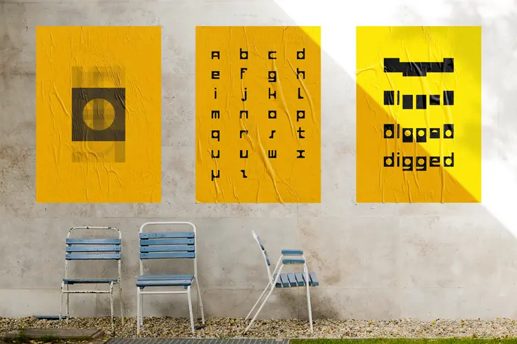
Digged
Typography
Abegno
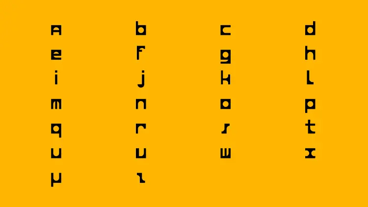
As part of a workshop at school with my typography teacher named Redouan Chetouan, I had the chance to make my own font. A new, original and rewarding work. For starting, we got one piece of paper with the word “abegno” printed on it. Is it possible to produce an alphabet from these 6 letters? Have a try: draw a “p”, then apply 180° rotation to it and you get a “d”…
Tipp-Ex to dig, black pen to fill
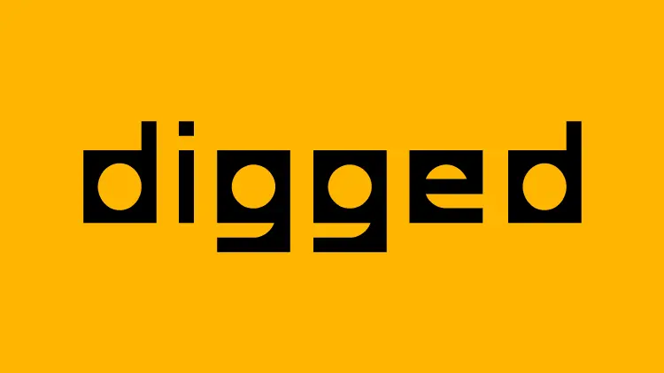
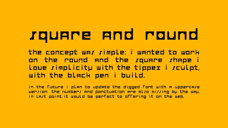
I wanted to realise a geometrical typography by using a circle and a square. First I drew with a black pen to create the shapes. After I filled them, I digged with a Tipp-Ex : painting a white circle inside a black square, sculpting the “o” letter… Few weeks later it was open house day at school. In order to promote my typography I designed posters. By superposing my 26 letters and bringing down their opacity to 20% we can see it's only based on the circle and the square shape.
Year
December 2015
Lire en Français 🇫🇷