QuBi
Graphic Identity
The Italian Personal Chef
In september 2018 I got back in touch with a former colleague I met in Cape Town in 2017 when we working together for a social startup. Long time ago she informed her wish was to create a project like a food truck or a restaurant. Ending 2018 she finally launched her personal chef-catering company for every type of events (birthday, farewell party, etc).
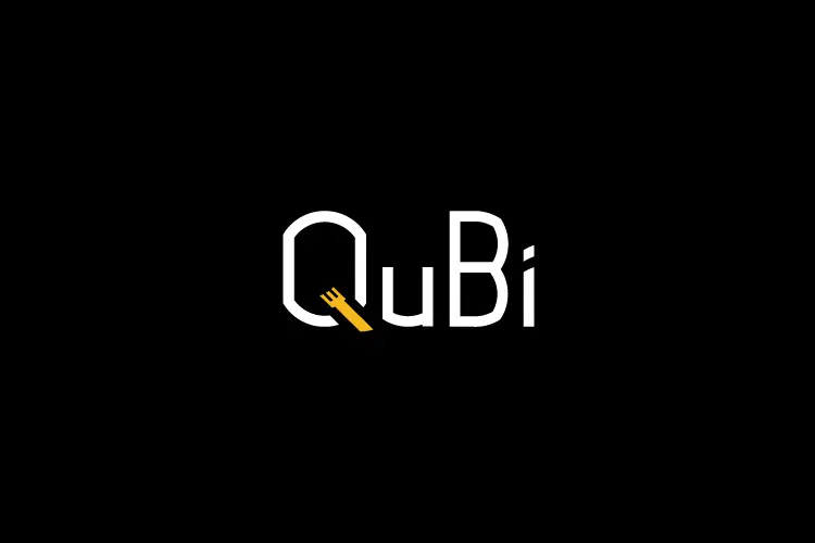
I suggested 2 creative routes for the project and I wished this first logo was chosen... Unfortunately my client prefered my second proposition that you can see here.)
Goal
How to describe the happiness a culinary experience with QuBi through graphic design ?
Creative solution
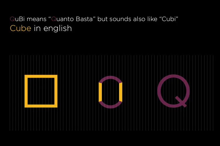
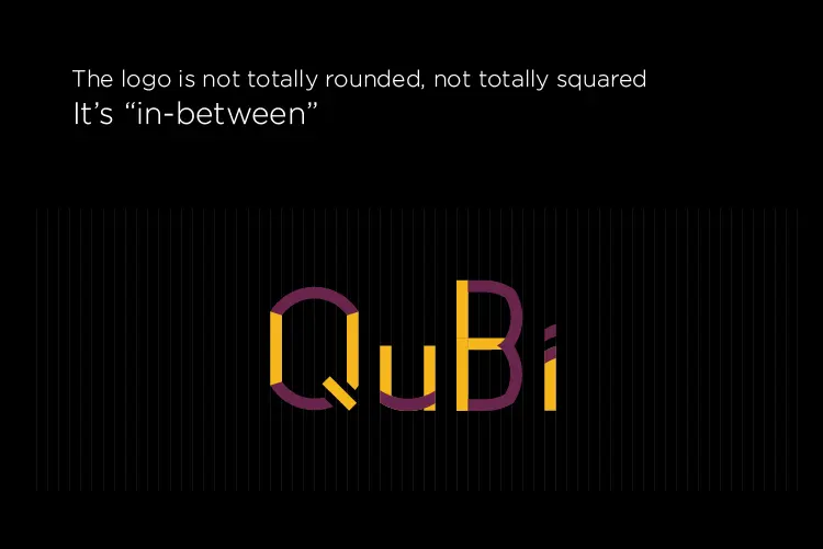
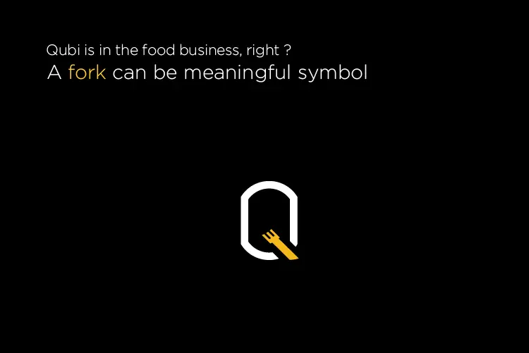
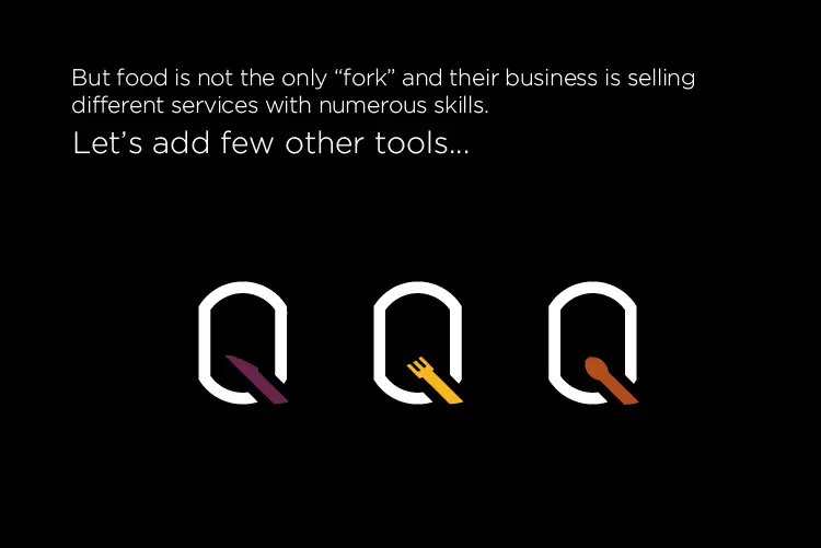
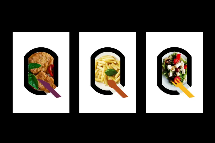
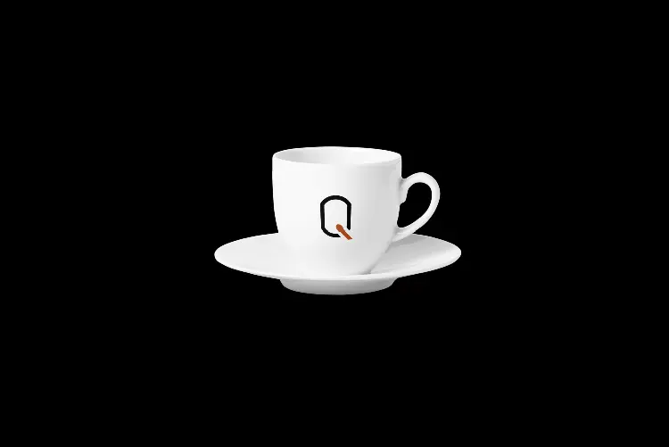
The logo shows a shape and colors in a minimalism style, whith a large rounded and squared outlining, linked to the name. As QuBi is not only a personal chef project but also a delivery-catering business, I decided to change the symboles, going from the fork to the spoon via the knife, in order to emphasize the various services of the startup.
Year
September 2018
Lire en Français 🇫🇷